Visually reimagining the story - ISTD Project
THE WIZARD OF OZ

The front and back cover of the book
The task for this project was to visually reimagine The Wizard of Oz by L. Frank Baum using little imagery and focusing on the typography and how we could experiment with different typographic forms.
THE BRIEF


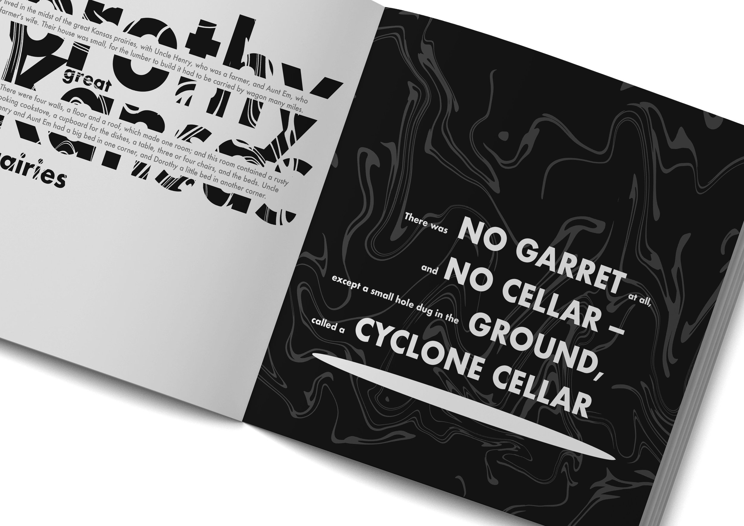
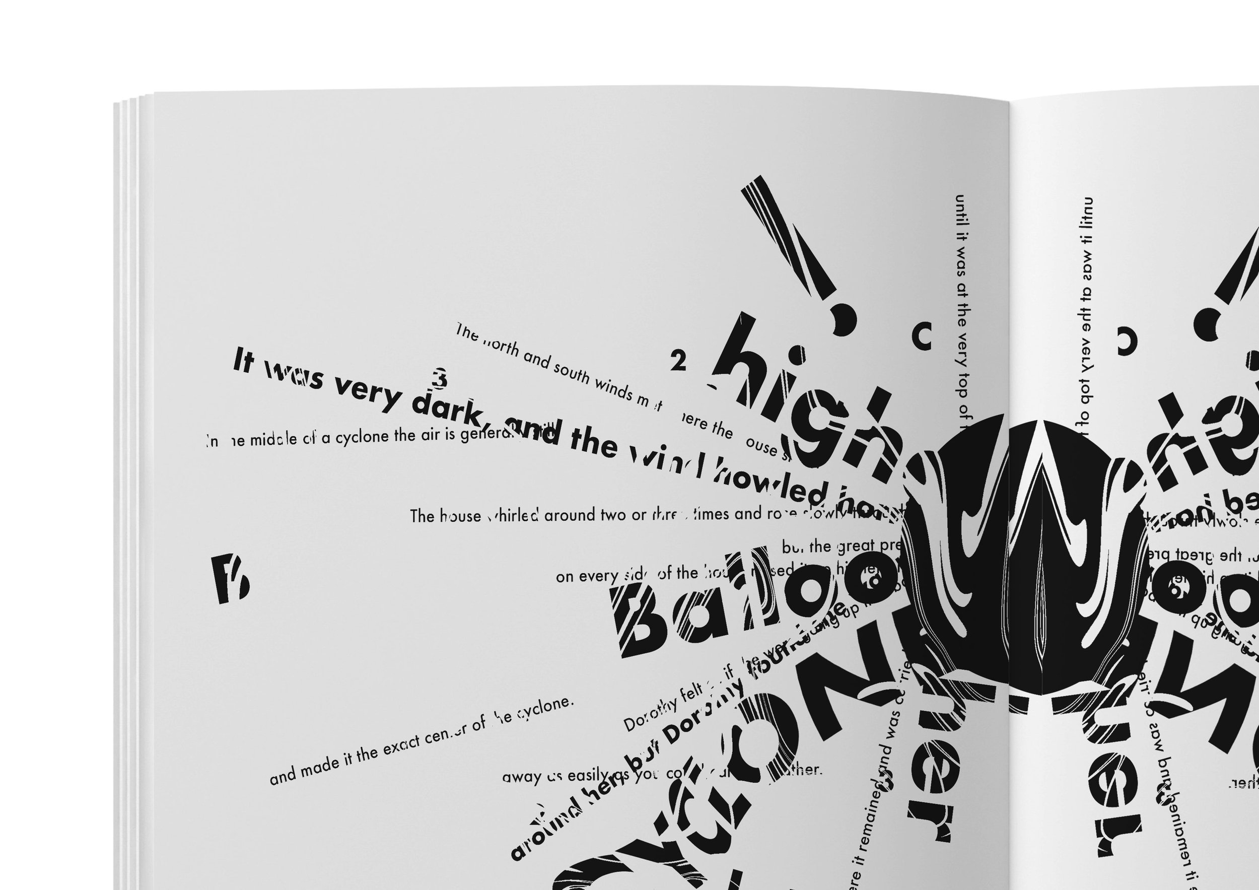
After in depth research about The Wizard of Oz, I decided I wanted to give the reader the same journey as Dorothy visually through textures, typography and colours, and create the emotions that she would’ve felt as well. The contents page highlights the chapters that I have aimed to make stand out in the book. The imagery shown through the typography at the start wasn’t too expressive to magnify the fact that everything is boring and plain in her home. When the whirlwinds from the cyclone begin to appear the typography begins to get more suggestive that something is going to happen soon.
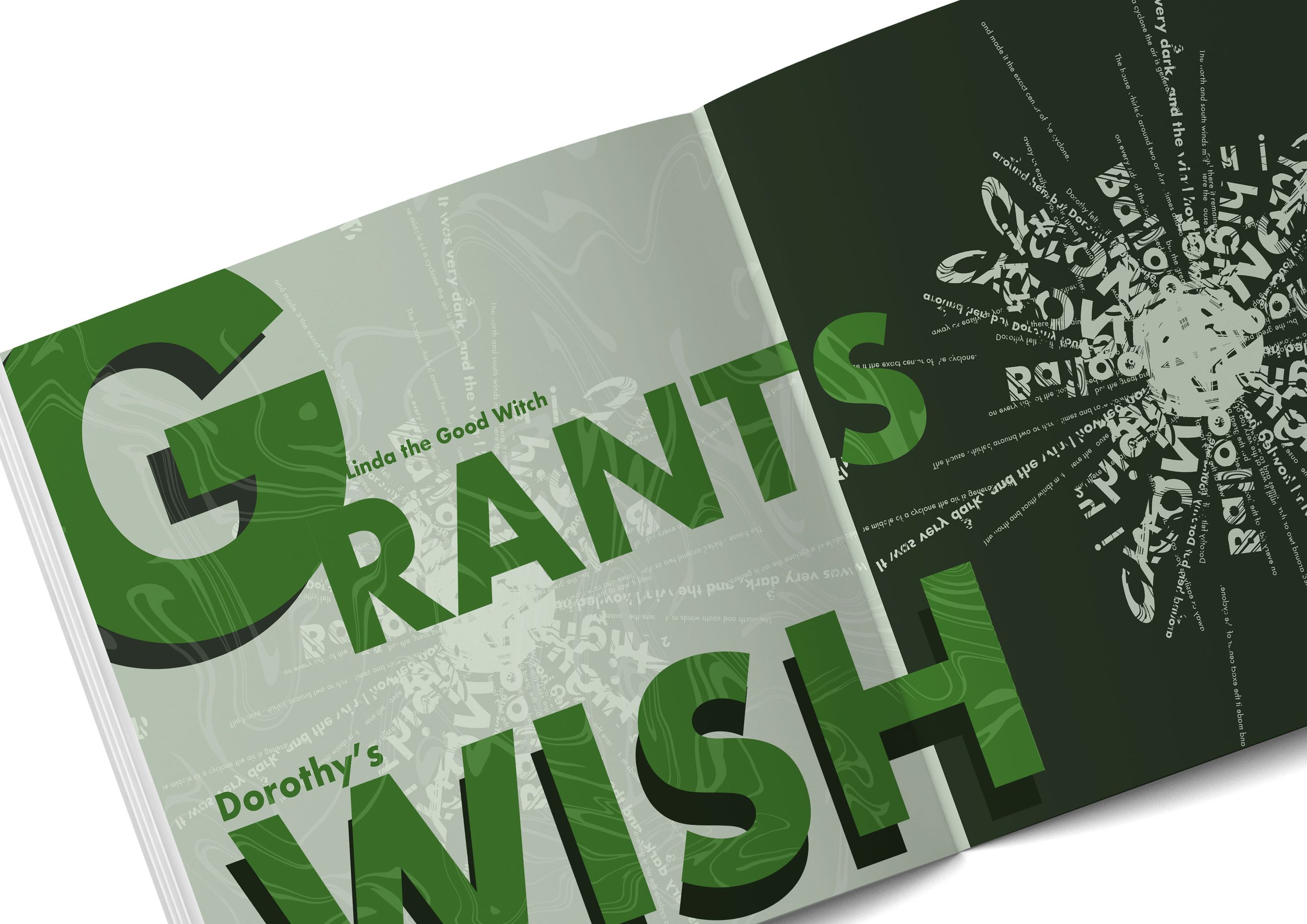
The pages continue with the bright and intense colours throughout her time in the Land of Oz, and this is to suggest the happiness in the new place and show the drastic difference from her home. I experimented with yellow, green and red because yellow gives the connotations of warmth and happiness. Green is to portray them being out in nature and it is also a very optimistic and calming colour. Red was chosen for the dangerous part of the journey to show danger and aggression. These are the emotions in which Baum was trying to hide from the reader, but I have chosen to bring them to light visually.
I wanted the book to have cyclical pages which is why the same typographic image of the cyclone at the start is used again at the end, and then we return to her dull home using black and white again, however this time there is a hint of colour with the yellow because Dorothy realises that there is no place like home and is therefore she is happy to be back.
PROCESS & EXPERIENCE


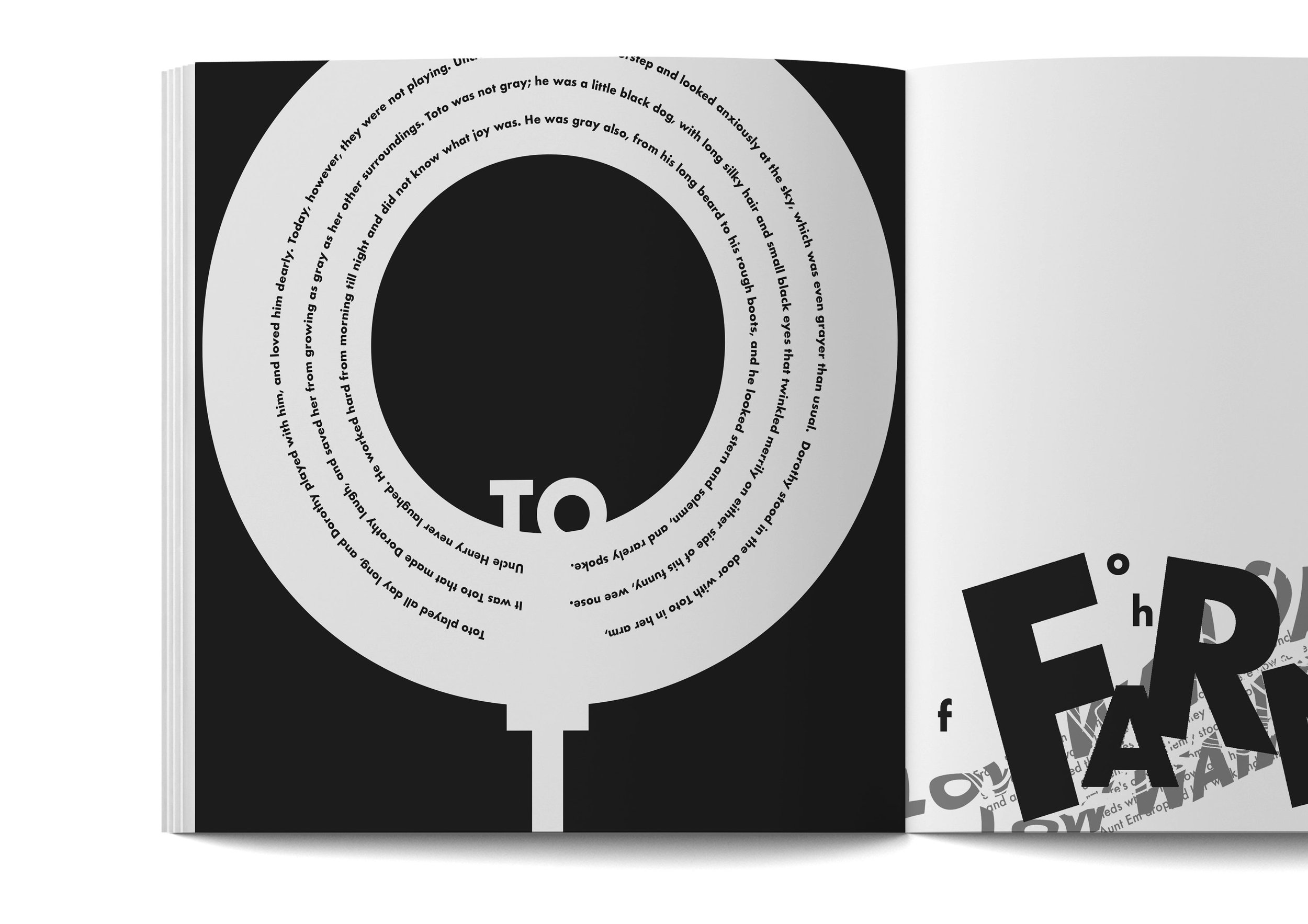
The images in black and white show the first chapter of the book in the dull colour palette to match with the storyline at the start of Dorothy in the ‘Dull and Grey Prairies’


These are the last few images from the first chapter


The second chapter focuses on bringing as much colour as possible to show the difference between ‘The Prairies’ and the journey to ‘The Emerald City’

The end chapter switches back to the original style when Dorothy arrives back in ‘The Prairies’
I am pleased with the outcome of this project, my typographic skills improved throughout the creation of this project and I enjoyed being able to creatively experiment and explore a different route to visually show The Wizard of Oz.